Material Components
Material Components are modular, meaning developers can pick and choose specific UI elements (such as buttons, cards, text fields) based on their application's requirements. This modularity enhances flexibility and allows for easy integration into existing projects.
About the component
- Last Update 25 Oct, 2023
- Component Version : 2.0.0
- API 21, Android 5.0 Lollipop
- 29 Blocks Available
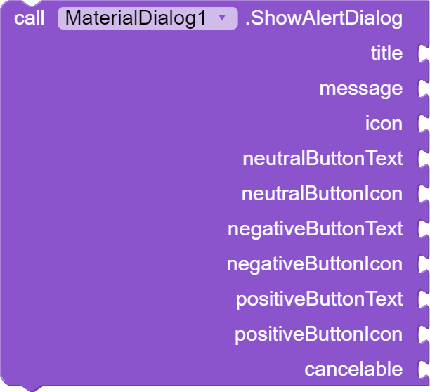
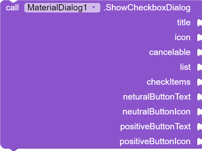
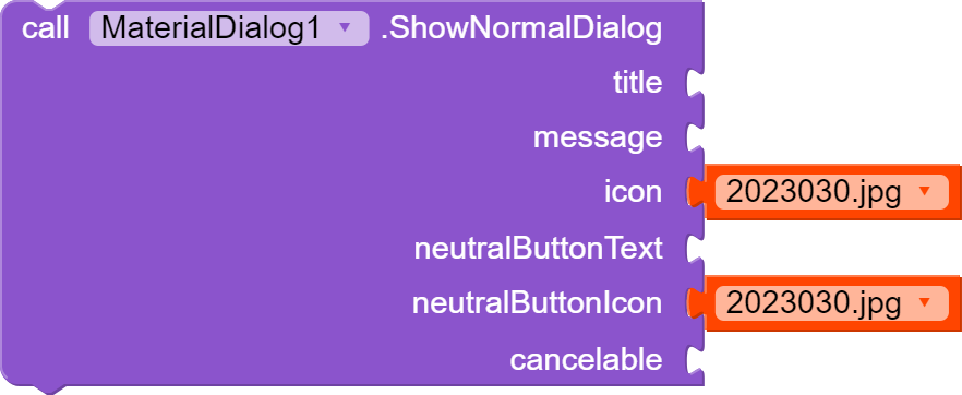
The Material Dialog component in AB allows for creating custom dialogs with Material Design principles. It supports various dialog types, including alert, custom, checkbox, list, normal, and radio button dialogs. It features events triggered after checkbox, list, or radio button dialogs are displayed, as well as when positive, negative, or neutral buttons are clicked. Methods are provided to dismiss alert or custom dialogs and to show different dialog types, allowing customization of titles, messages, icons, button texts, lists, layouts, and more.
Overview
Events
| # | Name | Type(s) | Default Value |
|---|---|---|---|
| 1 | index | List | |
| 2 | items | List |
| # | Name | Type(s) | Default Value |
|---|---|---|---|
| 1 | selectedItem | text | |
| 2 | list | List |
| # | Name | Type(s) | Default Value |
|---|---|---|---|
| 1 | selected | text | |
| 2 | selectedIndex | number |
| # | Name | Type(s) | Default Value |
|---|---|---|---|
| 1 | negativeButtonText | text |
| # | Name | Type(s) | Default Value |
|---|---|---|---|
| 1 | neutralButtonText | text |
| # | Name | Type(s) | Default Value |
|---|---|---|---|
| 1 | positiveButtonText | text |
Methods
| # | Name | Type(s) | Default Value |
|---|---|---|---|
| 1 | title | text | |
| 2 | message | text | |
| 3 | icon | text | |
| 4 | neutralButtonText | text | |
| 5 | neutralButtonIcon | image | |
| 6 | negativeButtonText | text | |
| 7 | negativeButtonIcon | image | |
| 8 | positiveButtonText | text | |
| 9 | positiveButtonIcon | image | |
| 10 | cancelable | boolean | True |
| # | Name | Type(s) | Default Value |
|---|---|---|---|
| 1 | title | text | |
| 2 | icon | image | |
| 3 | cancelable | boolean | True |
| 4 | list | List | |
| 5 | neutralButtonText | text | |
| 6 | neutralButtonIcon | image | |
| 7 | positiveButtonText | text | |
| 8 | positiveButtonIcon | image | |
| 9 | checkItems | list |
| # | Name | Type(s) | Default Value |
|---|---|---|---|
| 1 | title | text | |
| 2 | icon | image | |
| 3 | cancelable | boolean | True |
| 4 | Layout | Layout |
| # | Name | Type(s) | Default Value |
|---|---|---|---|
| 1 | title | text | |
| 2 | icon | image | |
| 3 | cancelable | boolean | True |
| 4 | list | list |
| # | Name | Type(s) | Default Value |
|---|---|---|---|
| 1 | title | text | |
| 2 | message | text | |
| 3 | icon | image | |
| 4 | neutralButtonText | text | |
| 5 | neutralButtonIcon | image |
| # | Name | Type(s) | Default Value |
|---|---|---|---|
| 1 | title | text | |
| 2 | icon | image | |
| 3 | cancelable | boolean | True |
| 4 | list | List | |
| 5 | checkItemsIndex | Number | |
| 6 | neutralButtonText | text | |
| 7 | neutralButtonIcon | image | |
| 8 | positiveButtonText | text | |
| 9 | positiveButtonIcon | image |


