Material Components
Material Components are modular, meaning developers can pick and choose specific UI elements (such as buttons, cards, text fields) based on their application's requirements. This modularity enhances flexibility and allows for easy integration into existing projects.
About the component
- Last Update 25 Oct, 2023
- Component Version : 2.0.0
- API 21, Android 5.0 Lollipop
- 29 Blocks Available
The Intro View component provides a customizable introduction or onboarding screen sequence for your application.
Overview
A visible component used to create an interactive introduction or tutorial sequence for your app, guiding users through key features.
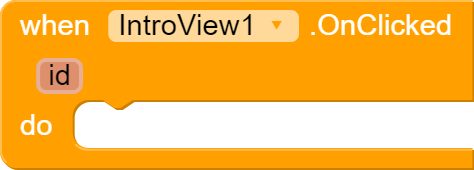
Events
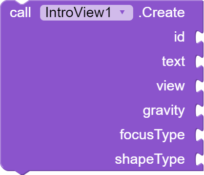
Methods
| # | Name | Type(s) | Default Value |
|---|---|---|---|
| 1 | id | String | |
| 2 | text | String | |
| 3 | view | Component | |
| 4 | gravity | number | center |
| 5 | focusType | number | normal |
| 6 | shapeType | number | circle |
Properties
| # | Name | Type(s) | Default Value |
|---|---|---|---|
| 1 | BorderColor | number | * |
| 2 | DotAnimation | number | * |
| # | Name | Type(s) | Default Value |
|---|---|---|---|
| 1 | FocusAll | text | #2574f4 |
| 2 | FocusMinimum | text | #2574f4 |
| 3 | FocusNormal | text | #2574f4 |
| # | Name | Type(s) | Default Value |
|---|---|---|---|
| 1 | GravityCenter | Integer | 0 |
| 2 | GravityLeft | Integer | 1 |
| 3 | GravityRight | Integer | 2 |
| # | Name | Type(s) | Default Value |
|---|---|---|---|
| 1 | Delay | Integer | 10 |
| 2 | Padding | Integer | 10 |
| # | Name | Type(s) | Default Value |
|---|---|---|---|
| 1 | ShapeCircle | Number | 0 |
| 2 | ShapeRectangle | Number | 1 |
| # | Name | Type(s) | Default Value |
|---|---|---|---|
| 1 | TextColor | color | #FFFFFF |
| 2 | TextSize | number | 16 |


