User Interface
User Interface (UI) refers to the visual and interactive elements of a digital system or application that enable users to interact with and control it.
About the component
- Last Update 25 Oct, 2023
- Component Version : 1.0.0
- API 21, Android 5.0 Lollipop
- 17 Blocks Available
A "Circular Progress" component in Blockly typically refers to a graphical user interface (GUI) element that presents a infinitaly animation of circular or radial pattern. Users can set it as a loading dialog, when something loads in background.
Overview
A visible component that indicates the progress of an operation using an animated loop.
Methods
| # | Name | Type(s) | Default Value |
|---|---|---|---|
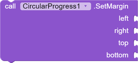
| 1 | left | Integer | 0 |
| 2 | right | Integer | 0 |
| 3 | top | Integer | 0 |
| 4 | bottom | Integer | 0 |
| # | Name | Type(s) | Default Value |
|---|---|---|---|
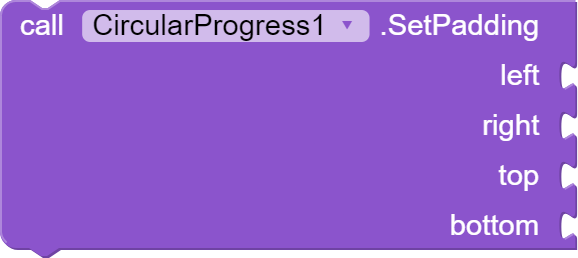
| 1 | left | Integer | 0 |
| 2 | right | Integer | 0 |
| 3 | top | Integer | 0 |
| 4 | bottom | Integer | 0 |
| # | Name | Type(s) | Default Value |
|---|---|---|---|
| 1 | get Color | return | #0000FF |
| 2 | set Color | text | #0000FF |
| # | Name | Type(s) | Default Value |
|---|---|---|---|
| 1 | get Height | return | -1 |
| 2 | set Height | Integer | -1 |
| # | Name | Type(s) | Default Value |
|---|---|---|---|
| 1 | get width | Integer | -1 |
| 2 | set width | Integer | -1 |
| # | Name | Type(s) | Default Value |
|---|---|---|---|
| 1 | set height percent | return | * |
| 2 | set width percent | Integer | * |
| # | Name | Type(s) | Default Value |
|---|---|---|---|
| 1 | get Visible | return | true |
| 2 | set Visible | boolean | true |


